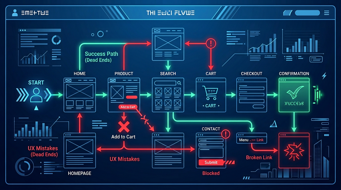
A showcase site must convert in a few seconds: a visitor looking for a plumber in Arles or a gîte in the Alpilles will not return tomorrow if he does not immediately find the telephone number, location and proof of seriousness. UX — user experience — is not reserved for large apps: it is the combination of clarté, speed and confidence.
Confusing navigation and unclear message
Too many sections, opaque business jargon or a generic slogan ("quality, responsiveness, listening") does not answer any concrete questions. Prefer a simple hierarchy: who you are, what you do, for whom, where, then contact. On mobile, the hamburger menu must remain accessible and the number clickable.
The friction that kills conversions
- Forms with too many required fields or without sending confirmation.
- Aggressive pop-ups before even reading the homepage.
- Heavy image carousels that obscure the essentials above the fold.
- Absence of customer reviews, real photos or visible legal notices.
Every extra click between intention ("I want a quote") and action reduces your chances — sometimes by half.
Speed and accessibility: the invisible foundation
In tourist or rural areas, network coverage varies. Optimizing images, fonts and scripts improves the experience for everyone and promotes local SEO. Also think about text contrast, touch area sizes and explicit button labels ("Call now", "Request a quote") rather than a vague "Learn more" everywhere.
CL WEB designs results-oriented showcase sites for PACA professionals: short workshops to clarify your priorities, readable models, tests on real phones. A good UX is measured: click rate on the contact, session duration on the Services page, calls tracked from the Google Business Profile file.